 |
 |
 |
 |
 |
![旅行时装 - 时装秀活动标识 [15P].png](https://img.doooor.com/img/forum/201401/12/043629rluzyy33tz3ayua3.png)
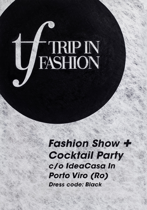
Trip in Fashion is a brand realised for a turn of events whose theme is fashion and travel. We thought of the naming and we projected the logo, the event identity and the prints.
We designed the lettering of the logo founding our inspiration in Didone typefaces. For all the prints on paper we chose the Favini Twist paper, which is characterized by a textile paired with opaque film and paper, in black and silver colours. As for the printing techniques we used offset and silkscreen. We used also a stamp with silver sealing wax for the envelopes. For the first event we realised a handmade poster too, with the black acrylic paint, a unique piece which combines together typography, calligraphy and graphic design. ![旅行时装 - 时装秀活动标识 [15P] (1).png](https://img.doooor.com/img/forum/201401/12/043629apxj1p7jrqj7rf7p.png)
![旅行时装 - 时装秀活动标识 [15P] (2).png](https://img.doooor.com/img/forum/201401/12/043630am2msynr326rm2xb.png)
![旅行时装 - 时装秀活动标识 [15P] (3).png](https://img.doooor.com/img/forum/201401/12/043630gsrvaj6g4ohnlklq.png)
![旅行时装 - 时装秀活动标识 [15P] (4).gif](https://img.doooor.com/img/forum/201401/12/043630luizfssw0m1suewi.gif)
![旅行时装 - 时装秀活动标识 [15P] (5).jpg](https://img.doooor.com/img/forum/201401/12/043631j82n6t258wzrrno8.jpg)
![旅行时装 - 时装秀活动标识 [15P] (6).jpg](https://img.doooor.com/img/forum/201401/12/043631d2uq08rlelezk3a3.jpg)
![旅行时装 - 时装秀活动标识 [15P] (7).jpg](https://img.doooor.com/img/forum/201401/12/043631ypuxmzpqu4xu4efm.jpg)
![旅行时装 - 时装秀活动标识 [15P] (8).jpg](https://img.doooor.com/img/forum/201401/12/043632nihwqz28118h01qh.jpg)
![旅行时装 - 时装秀活动标识 [15P] (9).jpg](https://img.doooor.com/img/forum/201401/12/043632s82t02p828rmsbbz.jpg)
![旅行时装 - 时装秀活动标识 [15P] (10).jpg](https://img.doooor.com/img/forum/201401/12/043632r2fwyt7122hlhf1h.jpg)
![旅行时装 - 时装秀活动标识 [15P] (11).png](https://img.doooor.com/img/forum/201401/12/043633rkufuufjcu6kff3f.png)
![旅行时装 - 时装秀活动标识 [15P] (12).jpg](https://img.doooor.com/img/forum/201401/12/043633jvmm1momqi82mv8f.jpg)
![旅行时装 - 时装秀活动标识 [15P] (13).jpg](https://img.doooor.com/img/forum/201401/12/043634km9lu0bjznjs77nl.jpg)
![旅行时装 - 时装秀活动标识 [15P] (14).jpg](https://img.doooor.com/img/forum/201401/12/043628r38ven1mv5oz85j2.jpg)
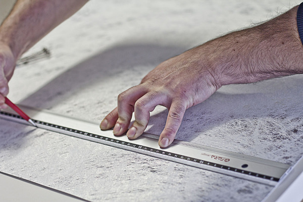

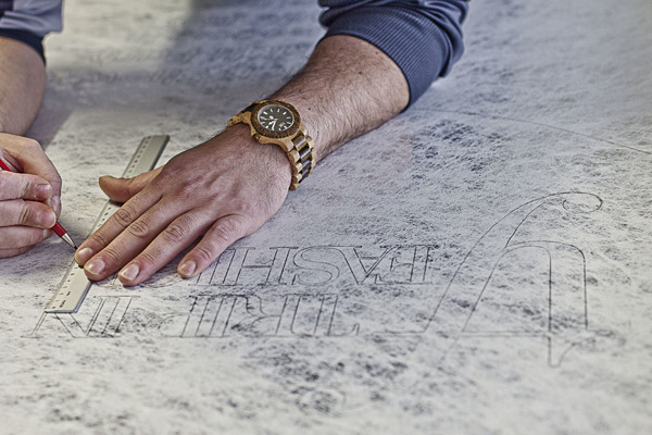
我们设计的标志开国我们的灵感在Didone字体的刻字。 有关纸张的所有印刷品,我们选择了FAVINI捻纸,其特点是搭配不透明的薄膜和纸张,黑色和银色两种颜色的纺织品。 至于印刷技术,我们使用的胶印和丝网印刷。我们还使用了邮票银封蜡的信封。 对于第一个事件,我们意识到一个手工制作的海报也与黑色的丙烯颜料,它的排版,书法,平面设计结合在了一起一个独特的作品。 |

