|
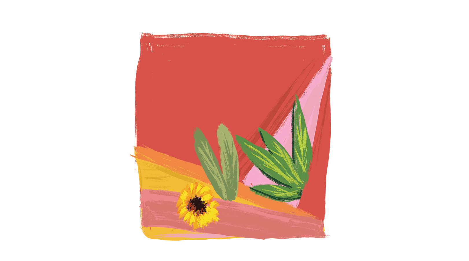
Offering nothing but quality, CBD-infused teas requires a brand identity and labeling that follows suit. AG Design Agency was contracted to develop a look that is unconventional in the world of teas and CBD products. They differentiated the flavors with a number of bright colors, highly contrasted by each other. The abstract illustration of the woman’s face seems to allude to the feminine quality and maternal aspects of nature, making the process of drinking the delicious blends all the more ethereal. 除了提供优质产品外,注入CBD的茶还需要跟上品牌标识和标签。AG Design Agency已签约开发茶和CBD产品世界中非常规的外观。他们通过多种鲜明的色彩来区分口味,彼此之间形成了鲜明的对比。女人脸部的抽象插图似乎暗示着女性的特质和自然的母性,这使得饮用美味混合物的过程更加空灵。 


|